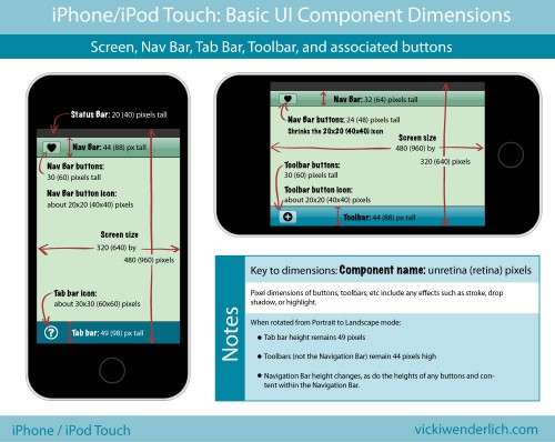
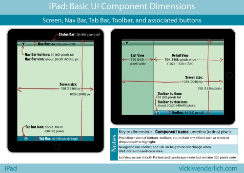
Ever since I created these diagrams showing the pixel dimensions for the most common UI components on the iPhone and iPad screens, I constantly find myself referring to them. The only problem was that I usually create the Retina art first. I got tired of having to multiply the unRetina dimensions by two, and I figured you all might too!
Here are the same diagrams, updated with Retina dimensions in parentheses:

Click for larger image
For those of you who would prefer a list instead, read on.
iPhone and iPod Touch Pixel Dimensions
Notes:
- Retina Dimensions are given in parentheses.
- All the dimensions for the iPhone are the same as for the iPod Touch.
- All pixel dimensions include highlight or stroke effects. For example, a 30-pixel high button is actually a 29-pixel high button with a 1-pixel highlight on the bottom.
iPhone screen size:
- Portrait 320×480 (640×960) pixels
- Landscape 480×320 (960×640) pixels
iPhone Nav bar:
- Portrait: 44 (88) pixels high
- Landscape: 32 (64) pixels high
iPhone Nav bar buttons:
- Portrait: 30 (60) pixels high
- Landscape: 24 (48) pixels high
iPhone Nav bar button icons: about 20×20 (40×40) pixels (when in Landscape mode, it shrinks the 20×20 (40×40) pixel icon)
iPhone Toolbar: 44 (88) pixels high (does not change)
iPhone Toolbar button: 30 (60) pixels high (does not change)
iPhone Toolbar button icon: about 20×20 (40×40) pixels
iPhone Tab Bar: 49 (98) pixels high (does not change)
iPhone Tab Bar icon: about 30×30 (60×60) pixels
iPad Pixel Dimensions
iPad screen size:
- Portrait 768×1024 (1536×2048) pixels
- Landscape 1024×768 (2048×1536)
iPad Navigation Bar and Tool Bars: 44 (88) pixels high
iPad Nav Bar and Tool Bar buttons: 30 (60) pixels high
iPad Nav Bar and Tool Bar button icons: about 20×20 (40×40) pixels
iPad Tab Bar: 49 (98) pixels high
iPad Tab Bar icons: about 30×30 (60×60) pixels
iPad List View: 320 (640) pixels wide. This is because when the same app is on the iPhone, the 320 (640) pixel width fits iPhone Portrait mode perfectly.

